
CARTIN'
How can gamification make local navigation more social and engaging?
Designing and launching the Scavenger Hunt feature for Cartin’, a social navigation app for low-speed vehicle (LSV) drivers. The feature turned everyday rides into playful community experiences through AI-generated hunts, team play, and local exploration. My role spanned from competitive analysis and UX flow mapping to high-fidelity UI design and developer handoff.
Platform
iOS
Role
Product Designer
Timeline
6 weeks (July — September 2025)
Tools
Figma • Figma Make • Mobbin • ChatGPT • Asana

Background
A newly launched app seeking ways to make navigation more social and fun
When I joined Cartin’, the app had just launched with its core navigation system in place. The team was exploring how to differentiate from traditional navigation tools by making the experience more engaging and community-driven. I led the end-to-end UX and UI design of the Scavenger Hunt feature, partnering closely with the co-founders and engineers to shape product direction and ensure technical feasibility.

The Problem
A feature in search of purpose
When I joined Cartin’, the Scavenger Hunt feature was already on the roadmap as a way to increase engagement. However, it hadn’t been validated through research, and its fit within a navigation product was unclear.
The concept risked feeling disconnected from Cartin’s core value of helping users get where they’re going. My challenge was to design the feature in a way that supported exploration while preserving the app’s utility and simplicity.
The Goal
Designing meaning into an untested idea
Even without formal research, I approached the project as an experiment, an opportunity to define how gamification could fit within Cartin’s product ecosystem. The goals were to:
Create an experience that encouraged users to explore locally and connect with their communities
Keep the interaction light and intuitive, so it never distracted from safe driving or navigation
Establish a visual and structural foundation that could support future games like Poker Run
Deliver a prototype that could help the team test assumptions and gather real user feedback before investing in development
Process
Finding direction in a feature that didn’t have one
1. Getting the lay of the land
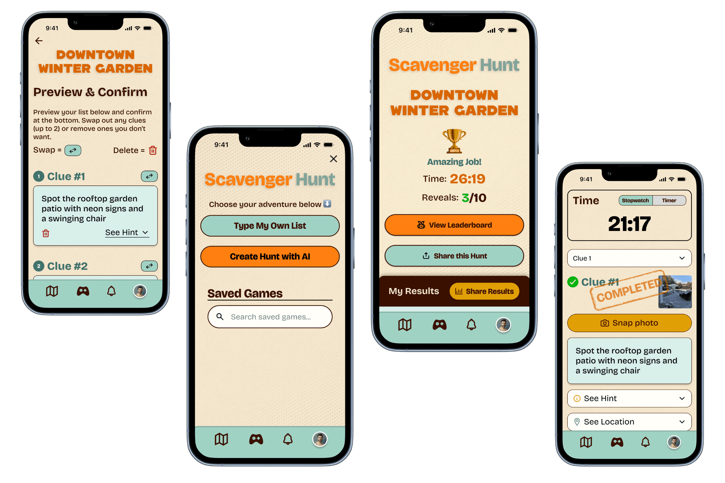
When I joined, one of the co-founders had already started building an early prototype of the Scavenger Hunt in Figma Make. It provided a useful starting point but also surfaced several UX issues, from misaligned text and inconsistent button placement to unclear flow logic. Before moving into design, I reviewed the prototype to understand what worked conceptually and where users might struggle to complete a hunt smoothly.


2. Understanding the market landscape
To get a better sense of how scavenger hunt experiences were positioned across the market, I conducted a competitive analysis of Let’s Roam, Scavify, Goosechase, and PlayTours. I compared their use cases, target markets, pricing models, and key features, identifying strengths, weaknesses, and differentiators that could inform Cartin’s approach.
Most competitors catered to corporate events, tourism, or education, not casual community use. That gap helped define Cartin’s opportunity to design a scavenger hunt tailored to recreational riders and local groups, with a lighter, more accessible structure than enterprise-level platforms.
3. Refining the Flow
Using the Figma Make prototype as a loose template, I began reworking the flow and visual hierarchy to align with Cartin’s design system. This meant standardizing typography, button placement, and overall spacing to match our existing UI language while improving clarity and consistency across screens.
I also restructured the creation flow to simplify decision points and guide users step-by-step — reducing friction and aligning with the app’s goal of making community play feel effortless.


4. Introducing AI
One early friction point was the initial prompt, which instructed users to copy and paste text into ChatGPT to generate their hunt. This felt clunky and out of place. After discussing feasibility with engineering, we explored integrating GPT directly into the app.
Once costs were approved by leadership, I redesigned the flow to let users create hunts natively, asking a few quick questions about location, group type, and mood before generating a personalized hunt. The result was a more cohesive experience that matched Cartin’s playful tone.
5. Accounting for Team Play
Midway through design, new requirements emerged: adding team functionality and leaderboards. This required designing additional states for users joining existing games and tracking team performance.
I mapped out user flows for both hosts and participants, ensuring that joining or creating a team felt intuitive across all use cases, from family groups to community events. The leaderboard was simplified to focus on clarity and friendly competition without cluttering the experience.


6. Testing & Handoff
After finalizing the designs, I met with the engineers to walk through each flow, explain user journeys, and highlight key design decisions. I also left detailed notes in Figma.
The feature was deployed to TestFlight for user testing, where we observed how well users could create and complete hunts without assistance. From there, I developed a usability testing guide to help structure future testing rounds as the feature evolved.
Through iterative refinement with engineering, the Scavenger Hunt evolved into an experience that blended playful competition with meaningful local exploration.
Design Solution
Designing a feature that finally felt at home inside the app
The redesigned Scavenger Hunt brought structure and consistency to an idea that started off fragmented. My goal was to make it feel like a natural part of Cartin’s ecosystem: simple, social, and cohesive.
Users can now create or join hunts directly within the app. The AI feature generates custom hunts from a few quick inputs, removing the need to copy and paste prompts elsewhere. When team play was introduced, I designed a new flow for users to join groups and track shared progress, while leaderboards were integrated to encourage friendly competition and replayability.
By aligning visuals with Cartin’s design system and refining layout, hierarchy, and spacing, the experience became lighter, more readable, and more on-brand, something that finally felt at home inside the app.


Outcome
From prototype to production
About a month after handoff, the Scavenger Hunt feature went live on TestFlight, marking the shift from design vision to working product. Working closely with engineering helped keep the build aligned with the design and make sure the core experience came through as intended.
Seeing the feature move from a Figma Make prototype to live testing was rewarding. It showed how collaboration can turn a rough idea into something real and distinctly Cartin.

Reflection
Designing in the gray
This project reminded me that product development rarely moves in straight lines. Requirements shift, priorities evolve, and sometimes the path forward isn’t clear until you start walking it.
I learned to stay flexible, to listen, adapt, and communicate clearly with the team as the feature evolved. This was a reminder that great design isn’t just about visuals or flow. It’s about staying aligned and keeping things moving, even when the path isn’t totally clear.