Streamlining Mental Health Therapy: A UX Case Study for Match Therapy
Project Type
Solo project for a Digital Mental Health Platform
Duration
5 months (January - June 2024)
Role
UX Researcher, UX Designer, UI Designer
Tools
Figma, Canva, Google Meet, Zoom, Jitsi Meeting, Otter.ai
Overview
Match Therapy aims to provide users with an intuitive platform for finding and connecting with therapists that best match their personal needs and preferences. The project involved comprehensive user research, iterative design, and usability testing to ensure a user-centered solution that facilitates better mental health support.
The Problem
People often face significant challenges when seeking mental health support, including:
Difficulty in finding a therapist that matches their specific needs and preferences.
Lack of knowledge of different types of therapy and mental health resources.
Limited information provided in therapist profiles, making the selection process cumbersome.
Struggle to find therapists or platforms online that accept their insurance.
Existing platforms often lack transparency on cost and detailed provider information, leading to frustration and a feeling of being overwhelmed.
The Solution
A website where users can search for therapists and schedule therapy sessions. The platform must accommodate all users - whether new or returning to therapy - and be mindful of the problems they encounter when trying to find a therapist or book a session. To address these challenges and create a more user-centered experience, I implemented a design thinking framework.
Research
To empathize with users and understand the specific challenges they encounter when seeking mental health therapy, I engaged in user interviews with a total of 5 participants. In order to evaluate the existing product options available in the market and identify functionalities that could be advantageous for our user community, I carried out contextual interviews with 4 of the 5 participants, in addition to conducting a thorough competitive analysis.
A SWOT analysis gave me a deeper understanding of how each website operates. This insight allowed me to empathize more deeply with users and proved beneficial for ideation.
User interviews
4 out of 5 users also participated in contextual interviews.
2 out of 5 users highlighted insurance/cost as an important factor when finding a therapist.
3 out of 5 users had already booked a therapy session via the internet.
Contextual interviews
Headway
Not enough information listed for providers.
Pricing not shown.
BetterHelp
Survey too long.
No insurance verification.
Psychology Today
No insurance verification.
ZocDoc
Insurance information inaccurate.
Lacking provider information.
Competitor analysis (Feature Comparison & SWOT)
Feature comparison was used to identify core competencies and product offerings.
Competitor Strengths:
Wide Network & Options: Grow Therapy & Headway boast extensive provider networks and diverse care options (therapy, psychiatry, medication management), with both virtual and in-person visits.
Detailed User Assessment: BetterHelp utilizes an in-depth entry survey to understand user needs and offers multiple communication methods (text, audio, video) with 24/7 support.
Competitor Limitations:
Limited Accessibility: Grow Therapy has a smaller network, while Headway operates in fewer states and excludes Medicaid/Medicare.
Focus on Digital Therapy: BetterHelp lacks insurance integration and offers limited phone support.
Affinity Mapping
Match Therapy's User-Centered Approach:
Educational Resources (MVP): We'll offer clear and concise resources to educate users about different therapy options, empowering them during their search.
Transparent Pricing & Insurance: Cost and insurance information will be upfront and transparent to avoid user frustration.
Detailed Therapist Profiles: Users will find rich therapist profiles with pre-recorded introductions and clear details about specialties and types of therapy, fostering trust and informed decision-making.
Inclusive Search Options: Implementing a robust search filter system with ‘insurance’ and ‘types of therapy’ options, among others.
Defining user needs and pain points.
Key areas where existing platforms fell short:
Limited Knowledge: Many users lacked basic knowledge about different therapy options, causing confusion during the therapist search process.
Cost Transparency: Cost and insurance information were a major concern. Users wanted this readily available to avoid surprises when booking an appointment.
Missing Therapist Information: Websites lacked crucial details like pre-recorded therapist introductions, social media links (to gauge therapist personality), and details about therapy specializations. This made it difficult for users to feel confident in their therapist choices.
User Persona
Information Architecture
With my user insights and persona created, I began to ideate potential solutions for my website starting with the Sitemap and then moving on to User Flow and Taskflows.
Sitemap
Interaction Design
Knowing that users do not typically enjoy the process of finding a therapist, it’s important that we streamline their search and avoid creating any unwanted obstacles.
The results are a user flow and taskflows that minimize the number of steps needed to get them from ‘searching’ to ‘appointment scheduled.’
User Flow
Taskflows
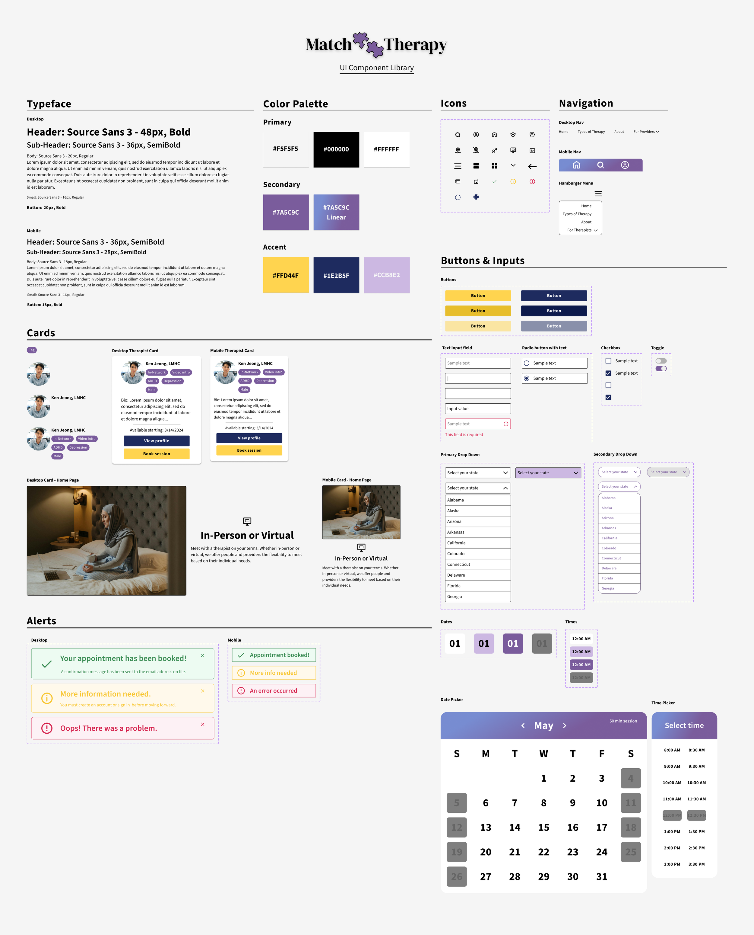
Next, I developed initial sketches and low-to-mid fidelity wireframes to visualize these solutions and explore different layouts for the Match Therapy platform.
Low Fidelity
Mobile Wireframes
Mid Fidelity
Desktop Wireframes
Prototype v0.1
Prototype
Created a high-fidelity prototype that allowed users to interact with core functionalities like the advanced search filters, therapist profiles, and booking process.
Testing
After building the brand, I completed the Prototype and worked with 5 Testers to understand if and how they were able to complete 4 primary task flows in Match Therapy:
Book an appointment
Sign Up
Login
Select insurance
Using a feedback grid, I listed what worked, users’ questions, ideas, and what they would change to inform my revisions.
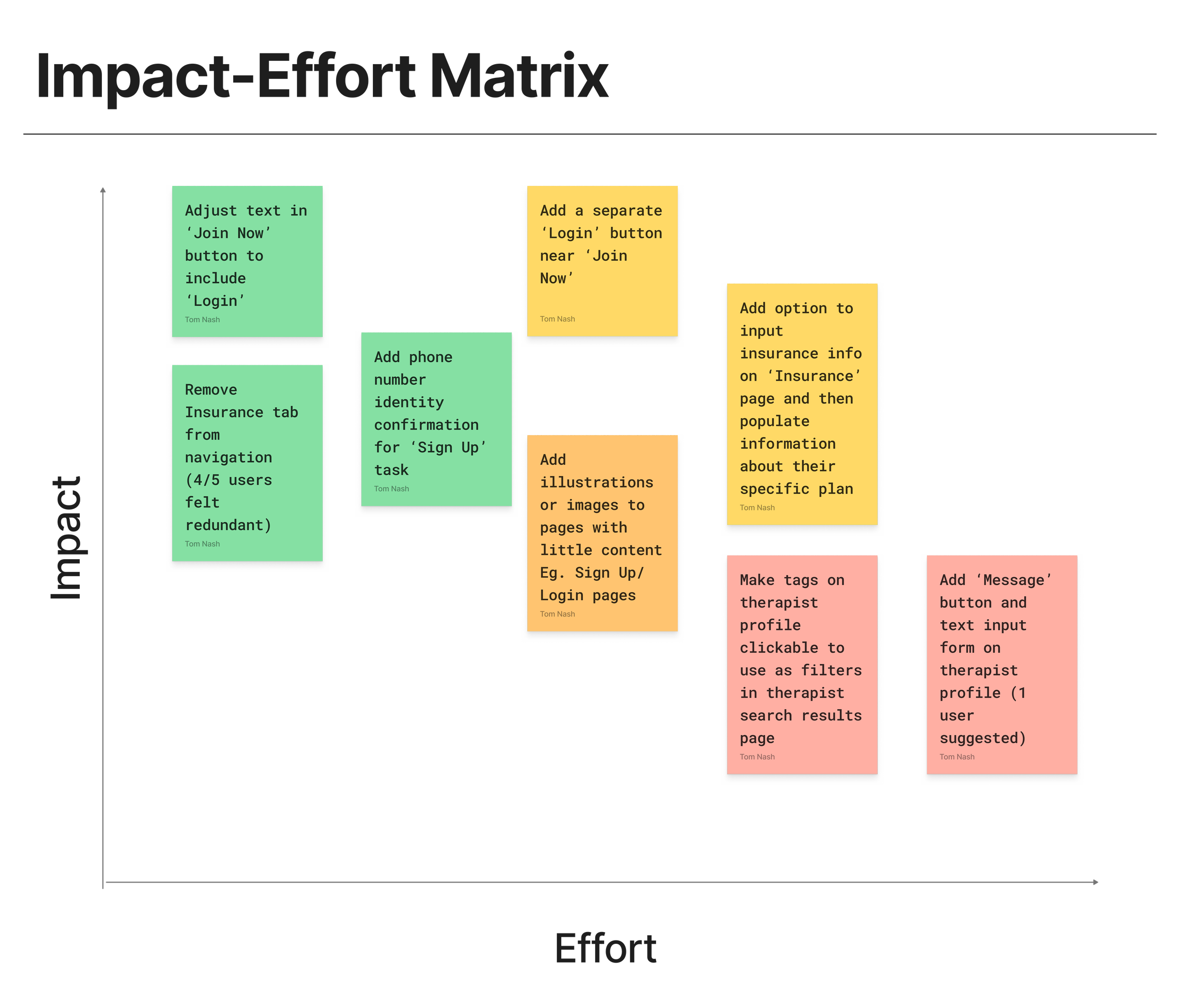
Priority Revisions
Added 'Login' text inside 'Join Now' button
Removed insurance tab from navigation
Added Google Sign Up/Login option (vs. phone number confirmation)
Signing up could be made easier, but email confirmation would still be required. With users and the business’s needs in mind, I chose not to introduce phone number confirmation
Added images to low content pages: Sign Up & Login (also added a page to differentiate Therapist vs. Customer Login).
High priority feedback
Login:
4/5 users were unable to login or voiced difficulty logging in.
3/5 users want ‘Login’ button visible or with ‘Join Now.’
Select insurance:
4/5 users found the 'Insurance' page redundant.
2/5 users did not choose the 'Insurance' link in navigation.
3/5 users suggested adding features to the ‘Insurance’ page.
Less frequent and severe feedback
Book an appointment:
2/5 users reported drop-down selections not populating in search results.
Sign up:
1 user suggested adding phone number identify confirmation, either in conjunction with email (2FA) or as an additional option.
General:
2/5 users suggest adding images or illustrations in various non-content-heavy sections of the website for better appearance.
Prototype v0.2


